Thursday, November 30, 2006

15 tips to choose a good text type

Many people have asked me which text type is best for a magazine, a newspaper, a poster, a newsletter, a publication, etc. In general, I tell them which to use, but I know that this is not the best answer, because they won't learn to do this by themselves.
Today, I want to take time to analyze how to choose correct text typography design in different cases. It is very important to understand that these tips are not final word, but they can be good help at the moment of choosing a text type. In any case, it depends on what do you want to convey with this type, because many times legibility is as important as the character of the type. Try to be very careful and take in account the following points:


1. The Letterform
The ‘ductus’ represents the framework of a type. It is very important. For legible text we need typographies with a simple ductus without complex details. Those details distract from the reading process and we need the reader to pay attention to the content and not the text.


2. The Weight
When we discuss the ‘weight’ of a type, we refer to a consistent relationship between the characters themselves, and the light of the page that flows around them. If you use a light version of a type for a lot of text, reading of this text will probably become tiring and nobody will want to read it.
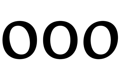


3. The Contrast
The contrast refers to the thickness difference between vertical and horizontal strokes. The difference between the thicker and the thinner part of the character. Bodoni and Didot are very contrasted type designs. Try to read the photocopy of a photocopy of a photocopy of text layed out in Bodoni. You will probably see only vertical strokes. Good type design should be able to resist a lot of copies. It must be strong, solid, but not coarse.
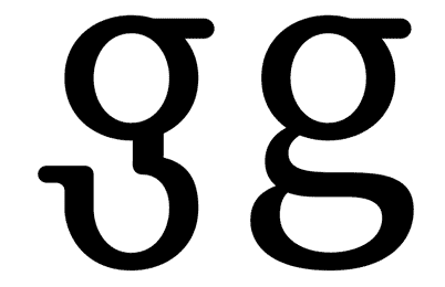


4. The axis
In my view, the axis of a type design could affect reading. Vertical strokes prevail in a text type and if the axis is diagonal, the eye will have trouble following that line of text. If the type uses more than one axis, a line of text will appear as if dancing which makes is harder to read. If we use an orthogonal axis, the characters can't dance.


5. x height
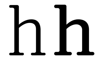
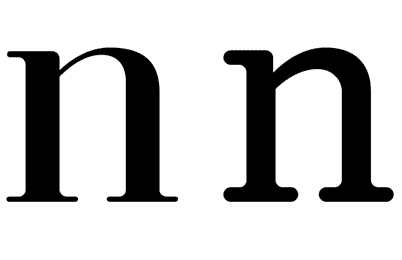
The area between baseline and x height contains most of the readable information (75% of the lower case letters). It is a very important area at the moment of reading text. Long ascenders and descenders require a small x hight. If we compare two types of designs, one with long ascenders and the other with short ascenders, we can see that the x height of the second one will be larger, so it will obviously be more legible. Look up for the difference between Times New Roman and Mrs. Eaves.


6. Capital letters height
Older typefaces designs consider the same height for the ascenders and the capital letters. In any cases capitals are bigger… But the appearance of a word in upper case between lower caps is usually ugly. When I write the word ‘Garamond’ I feel the ‘G’ as a dinosaur and the ‘a’ as its prey…


7. Endings and details
When we use a font in a big size (for example in a poster), we enlarge everything. All the small details of the type design become evident, as well as the mistakes. A lot of typographies are badly drawn. As designers, we should not accept this.


8. Text and texture
A block of text looks like a texture from a distance. This texture must be uniform, without thicker characters or spots that could attract the attention.


9. Degree of the Counter Opening
In many type designs, the counters are too closed. It could cause legibility problems, because somebody could read 'o' instead of an 'c'. So, if the internal counter is too opened (as in Frutiger), it will start to mingle with the external counter, generating a lot of white (and it looks ugly).


10. The Fish Effect
This effect becomes evident when the internal counter is bigger than the space between characters. It looks very strange where round and straight characters join.


11. External counter
There are small details that make a text type design more legible. A carefully designed external counter leads to better text understanding. Think about the connection between the vertical stroke of the ‘n’ and its curve, or the difference between ‘rn’ and ‘m’.


12. Internal counter
A small eye in an ‘a’ or an ‘e’ character will probably disappear, especially in small type sizes. These are the most used characters in most of the languages, that is why this becomes a very big problem.


13. Is the set complete?
How many times do we note that the font we are using lacks a character? It always happens when our design is almost finished. Terrible! We must change the type and check out the complete text again. Many type designers don't design some characters such as ñ, written accents, tildes, points, commas or numbers… It is better to check the font out before using it.


14. The family
It is important to verify that the type family is plentiful, with variations in weight, black, whites and italics… Check out that the italic is as legible as the regular version. Sometimes they have a lot of rococo details.


15. Letter spacing
There are fonts with bad or non-existent letter spacing and obviously, they don't work well. A good designer will try to correct the letter spacing that he (she) considers bad, but it is too much work when all the spacing looks bad… There are software packages that can help, but it is not the same as good typographer work. Try to use fonts with correct letter spacing and metrics…


639 Comments:

Anonymous Anonymous said...

Excelente blog al igual que Letritas. Ya lo estoy recomendando a amigos y alumnos. Te cuento que empece con un blog:

http://fabioares.blogspot.com/

No soy un especialista en web pero tengo muchos años de gráfico y quería participar.

Te mando un saludo desde BA.

3:11 AM  
Anonymous Anonymous said...

Ok, what about learning English properly and for e.g. using with instead of "whit"...

7:26 AM  
Anonymous Anonymous said...

Muito bom!!

8:03 AM  
Anonymous Anonymous said...

I really enjoyed how you analyzed the typeface and pointed out systematic approaches to finding a pleasant typeface.

Another consideration that must be taken into account is the proper usage of faces when setting a longs blocks of type. Choosing the proper size and leading and line length are also very important and vary depending on the face. One could very easily choose a pleasant looking typeface but use it in a very unpleasing way.

However, I must agree with you that often times people select some very poor typefaces to use.

2:07 PM  
Blogger Julián Rodriguez Orihuela said...

You forgot to translate #11.
And what the anonymous user said (a little harshly) about the use of "with" could improve legibility.

Saludos y Feliz año.

10:16 PM  
Anonymous Anonymous said...

"Ok, what about learning English properly and for e.g. using with instead of "whit"..."

E.g means for example. You've basically said "and for for example using with..."

Why not give the guy a break, he you don't have to read the tutorial. Try learning English yourself too.

10:49 PM  
Blogger Kyle said...

The first anonymous needs to shut up, for he does not use "e.g." properly, so he does not use English properly.

Happy new year, and I really enjoyed reading your blog entry about font stuff. I work on websites for the university I attend, and always enjoy reading about typography.

1:42 AM  
Blogger Googe said...

Thank you so much for this article.

I'm in a bind because I can't yet come up with the best set of types and sizes. People say they like it, but I'm never satisfied in that regard.

Phil
http://www.indierockcafe.com

1:47 AM  
Anonymous Anonymous said...

Very nice article, indeed! Thanks.

2:25 AM  
Anonymous Anonymous said...

Very nice. I'll try to remember some of this so i can use later =D

4:56 AM  
Anonymous Anonymous said...

Fabulous article! Great for both those who have studied typography and those who never even knew it existed. Bookmarked!!

5:54 AM  
Anonymous Anonymous said...

What a well laid out self explanatory graphic article that hits the points right away.
www.glendalegolfs.com

6:01 AM  
Blogger geokker said...

Fascinating article, I won't look at typefaces in quite the same way again!

8:48 AM  
Anonymous Anonymous said...

I'd love to see this whole article on eioba.com

8:53 AM  
Anonymous Anonymous said...

You could change "tiredness" to "tiring".

I loved and learned from your article.

10:06 AM  
Anonymous Anonymous said...

There is an important element missing.

If you are selecting a typeface for the text portion of a web page, you must be aware of two key elements: (1) many browsers allow the user to tinker with the font size; (2)it is the user, not the web designer, who chooses the screen resolution.

Therefore, you need a typeface which will not only cover up your own mistakes, but your readers' as well! A good test is to take your short list and shrink them all down as small as you reasonably can to see which of the typefaces can withstand the most compression and retain perfect legibility.

Or, you can skip all the verbosity and just use Verdana.

12:15 PM  
Anonymous Anonymous said...

Thanks a lot! This post is really good. Please, keep up the good work.

4:32 PM  
Anonymous Anonymous said...

Thanks a lot. It really helps. A good, thorough artcile. I appreciate your efforts and time for the useful article. Very rare we see a 'complete' information like this.

11:02 PM  
Anonymous Anonymous said...

Wonderful, thanks for taking the time to write this.

Now, for those ignorants who are bitching about "proper english", how about you narrow minded losers try to learn a second language? There is plenty of people here that is able to read this article in both languages without a problem. I guess that makes YOU the dumb ones.

5:53 AM  
Blogger Arun Jay said...

Very helpful indeed!
Thanx a ton!

8:36 AM  
Anonymous Anonymous said...

I agree with many of the posts here - it's an excellent review of the typographic basics; perhaps something we all need to remind ourselves with occasionally.

Also, as someone struggling with a second language, I cannot believe how narrow-minded and petty some people are concerning typos. Anonymity sure seems to make heros of them all (in their minds, that is). Isn't this another example of "shooting the messenger" and ignoring the message?

Please — let's be gracious with each other!

10:29 AM  
Anonymous Anonymous said...

This is the kind of explanation I can share with my parents...and they'll understand.

10:48 AM  
Blogger Juan Pablo De Gregorio said...

Thanks again for posting!!!

and if you want to follow reading about this post, you can go at the page of India Amos with an excellent article:

http://indiamos.wordpress.com/2007/01/02/choosing-text-type/#comment-2649

Thank you again

10:18 AM  
Anonymous Anonymous said...

poor writing inhibits readability just as much as typeface choice... perhaps more in this case.

12:22 PM  
Anonymous Anonymous said...

Wow!! Wonderful!
In totally in love with typography and always looking for articles about it. It's too rare find ppl really explaning how to do instead of doing it. Congratulations!

Jesus. Why ppl need to comment without a name? Well, let thay talk. But I must say that I really loved the way u write in english. Of course I've noticed that u weren't american (ou some), but it was not 'cuz os the "mistakes" (that I make too), but because u write in such an easy way. It's easy to read and comprehend it. :]

See u :]

12:36 PM  
Anonymous Anonymous said...

I'm afraid that this article didn't really illuminate anything for me. The definitions of those aspects of the fonts are nice, but how do you apply this in different situations to choose an appropriate font? Based on your criteria there would seem to simply be one "best" font overall in terms of readability... simple, bold, high contrast... Ok... So why are there 1000 different fonts that people use? What do they convey and "feel" like... how should you mix them? Are there groups of fonts that go well together?, etc... That's what I'd like to know.

1:44 PM  
Blogger e. donovan said...

Excellent post! I can't believe how petty some people are to criticize the English in it. The pictures are worth a thousand words in any case...

One thing that could improve the post would be a list of fonts that, in your opinion, exemplify both the good and bad qualities you discuss.

4:15 PM  
Anonymous Anonymous said...

Wow, what an excellent primer on fonts! :)

9:15 PM  
Anonymous Anonymous said...

this was very informative, but as noted above, i'd love some conclusions / recommendations: what's the author's recommendation for a good, general-use font for text? what about a sans-serif suggestion for spreadsheets? with the article, i can now pinpoint flaws in certain typefaces, but what i really want is to be pointed to the least flawed typefaces. i currently use LIDO for documents, because i find times new roman to be rather ... scrawny.

6:13 AM  
Anonymous Anonymous said...

Thanks a mill for this intro to Typography. La verdad, todos necesitamos a few classes para aprender y manipular mejor this medium.

When dealing with web and type tenemos que tener en cuenta cuales son the fonts that come as default en los different systems.

Pero for graphics and design, podemos utilizar cualquier fuente que queramos. Asi que using Verdana, o Garamond would be like asking rebrant to use una brocha gorda.

Muchisimas thank yous

7:54 AM  
Anonymous Anonymous said...

Great little article, easy to see the differences. I do some DTP for personal use - will remember your guidelines. Thanks

7:06 AM  
Anonymous Anonymous said...

#5 is not properly demonstrate.

x height is actually the x height, this is not what you are showing.

instead of showing "fop" you should have showed "fxp" where the red lines are at the bottom and top of the x.

x height does not apply to capital X.

Regards,

Eric (also from Canada)

5:22 PM  
Blogger Juan Pablo De Gregorio said...

The example is good.

Both fonts have the same height, but the second have a bigger x height.
Red lines is showing that both fonts was showed with the same number of poins....


excuse me for my poor english

5:33 PM  
Blogger Bruce said...

Great tutorial. I am an editor, not an art director, but your tips were very useful. I knew some points, but others were new to me. I also liked the typefaces you designed. Have you posted a list of a few of your favorite faces anywhere? For English? For Spanish? And...your English is fine. Good enough to communicate your very refined visual sense and deep understanding of typography. Thanks.

7:11 PM  
Anonymous Anonymous said...

I agree... but the example does not demonstrate the X height at all, just the font size.

Take a look here and click on the image... you will see what I mean by x height.

http://en.wikipedia.org/wiki/X-height

7:11 PM  
Anonymous Anonymous said...

Nice, Really nice.. The world needs more entry's about this.. Well Just the Latin America maybe. Because haven't all the people have the culture of the typography election.

10:14 PM  
Anonymous Anonymous said...

Thank you, very much.

I really appreciate the time you spent in writing this article.

Ignacio Beltrán

3:43 PM  
Anonymous Anonymous said...

[ Anonymous said...

Ok, what about learning English properly and for e.g. using with instead of "whit"...]

And your comment was way out of line. Here is a person who shares his knowledge with us, for free, and that's your only comment?
All apologies to the author for the spoiled brats comments. Most people genuinely enjoyed your article.
-Chris

5:29 PM  
Anonymous Anonymous said...

Very nice article. It really reminded me that it is important to make these choices consciously.

And for those who possess such excellent English writing skills, how about pointing out some more mistakes instead of just making snobbish remarks...

I'd love to, but my English is unreliable as well.

8:07 AM  
Anonymous Anonymous said...

Interesting information indeed. Thanks for tips!

6:02 AM  
Anonymous Anonymous said...

Possibly one of the most dis-passionate typographic analysis' I've read (apart from more technically led typographic anatomy discussions ie 'what does x-height mean' etc). It's odd that you have written about a topic in such an un-emotional manner when choosing a particular typeface effects the way someone will feel when reading whatever you have typeset. Typography is a lot more exciting than this.

8:48 AM  
Anonymous Anonymous said...

grazie, thank you very much. from venice, italy. gracias. laura

5:48 AM  
Blogger Juan Pablo De Gregorio said...

Let me give special thanks to Jasmina for help us.
Thank you very much.

9:18 PM  
Anonymous Anonymous said...

An older fellow into computers once remarked it was remarkable - his late father was a printer and 10 times the fonts than this printer could be easily downloaded onto one floppy diskette.
www.winnipegjobshark.com

2:36 PM  
Anonymous Anonymous said...

exelente blog yo trabajo en www.estudiocromatic.com.ar (un portal de diseño grafico y diseño de paginas web) y es un tema la eleccion de fuentes tipograficas tengo miles de fuentes en el estudio y se me hace muy dificil elejir una

6:20 AM  
Blogger mga said...

hi

found the content of your blog stolen in a splog (will break up the url so it does not get linked):

www. ablogyoucanuse .com
/2007/04/22/
15-tips-to-choose-a-good-font/

maybe these tips will help you deal with this issue:

http://www.wired.com/culture/lifestyle/news/2005/10/69380
http://forums.feedburner.com/viewtopic.php?t=13473&highlight=splog

9:40 AM  
Blogger emily said...

my friend just recommended your blog to me and i have already become addicted. it's very helpful when it comes to picking fonts and playing with typography. thanks!

2:18 PM  
Anonymous Anonymous said...

These comments have been invaluable to me as is this whole site. I thank you for your comment.

12:10 PM  
Anonymous Anonymous said...

Thx for the excellent information !

2:57 AM  
Anonymous Anonymous said...

thank you, I am not a designer, but I aprecciate this kind of sites to get a much proper work (of any kind) into paper.

3:41 AM  
Blogger Unknown said...

Wonderful article. It was a very interesting read.

4:45 PM  
Blogger Kuda Boalha said...

Excellent article, i had been meaning to read up on this font typography thing... you saved me a lot of searching. thanks. keep it up

4:57 PM  
Anonymous Anonymous said...

Your assertion that small X-heights are good is wrong. While 75% of letter forms may in fact be in the same region as lower case, that isn't what makes things easily readable.

Try printing out a sentence and covering up the center 50% of the words (vertcally). A good font, with proper x-height, means you can still read it. That lends it to be read very quickly. Improper or too-short x-heights drastically affect reading speed, particularly for those with vision problems (cateracts, etc can cause dramatic vision loss in the center of focus, so they will only see the tops/bottoms and ascenders/descenders of letters).

This is particularly true for large text or text intended to be read at distances. It is also why the US Government is moving away from ALL CAPITALS on road signs as changing them over to proper upper and lower case lettering. The human eye recognizes the shape of a much faster than it can parse individual letters and assemble the world.

Also, you left out a very important point for proper typography and readability: ligatures.

5:12 PM  
Anonymous Anonymous said...

Great, many helpful stuff - thanks!
http://tubeurl.com

5:22 PM  
Anonymous Anonymous said...

I'm blind, and this article didn't make any sense to me.

8:19 PM  
Blogger Grendi said...

Great!!!

Pretty cool!!!

10:18 AM  
Blogger studionashvegas said...

Very well spoken. The illustrations really bring the point home.

Posted on http://www.studionashvegas.com with credit to you

7:53 PM  
Anonymous Anonymous said...

Interesting article. I also like the combination of illustration and explanation. Even though I have troubles understanding the concept of internal, external counters. What do mean by "counter"?

9:09 AM  
Blogger Juan Pablo De Gregorio said...

A counter is a counterform.
The white space that is not the form of the character

9:11 AM  
Anonymous Anonymous said...

Excellent post, friend. It's always good to know this kind of stuff!

7:03 AM  
Anonymous Anonymous said...

It is just a reminder to me about type, because even if you look at it and say, it's just letters, a bad typography can ruin a perfect concept.

By the way, stop criticizing the spelling or grammar, because the article ain't about Spanish or English grammar.

3:00 PM  
Blogger Max Yakin Bozek said...

El tema da para muy largo, y obviamente se pueden seguir agregando muchísimas condiciones determinantes.
De todos modos tus 15 tips son una muy buena síntesis.
¡Da para recomendarlo!
¡Saludos!

x.

2:08 AM  
Anonymous Anonymous said...

Therefore, you need a typeface which will not only cover up your own mistakes, but your readers' as well! A good test is to take your short list and shrink them all down as small as you reasonably can to see which of the typefaces can withstand the most compression and retain perfect legibility.
Amaryl Online

6:28 AM  
Anonymous Anonymous said...

Fabulous article! Great for both those who have studied typography and those who never even knew it existed. Bookmarked!!

Buy ventolin no prescription

6:10 AM  
Blogger Tekno Boy said...

Nicely put. I always like learning about type, people don't realize it can make or break your art.
http://www.youtukan.com

6:56 AM  
Anonymous Anonymous said...

A very nice blog entry on font and typography. Keep it up.

Dollar Lifetime Backlink

9:42 PM  
Anonymous Anonymous said...

#10 needs to come after #12. You introduce a term before defining it, and it breaks the otherwise perfect continuity of this.

9:38 PM  
Anonymous Anonymous said...

Great examples! Thanks for posting the step-by-step instructions for creating better text/copy.

7:01 PM  
Anonymous Anonymous said...

some designer have to learn to make their text readable in stead of chaos

5:35 AM  
Anonymous Anonymous said...

Good Job! :)

4:41 AM  
Anonymous Anonymous said...

This blog was very helpful to me

7:09 AM  
Blogger Unknown said...

"Ok, what about learning English properly and for e.g. using with instead of "whit"..."

You're focused on spelling with such an excellent blog? Are we feeling insecure?

Typography is an art. Online English criticism is not.

There are other ways to feel better about yourself, like improving your own life.

12:52 PM  
Anonymous Anonymous said...

What font is used for "Kerning" above?

11:47 PM  
Anonymous Anonymous said...

very informative article! amazing! thanks for sharing it. i learned a lot!


mc

5:39 AM  
Anonymous koxp said...

Koxp koxp thank you man

4:12 PM  
Anonymous Koxp said...

Thank you

5:30 AM  
Anonymous asdxdsa said...

sağol

12:04 AM  
Anonymous Remco said...

For the anonymous guy that has complaints about the English...A good English sentence in your case would be "What about learning proper English". Now you're actually talking about the English itself instead of the learning process(learning English properly).

Make sure your English is flawless when you start correcting people. Loser.

For the guy that did the tutorial. Don't mind these moaning people. You've done an excellent job with this tutorial. I had fun reading it. Thnx!

1:21 AM  
Blogger Wintermute said...

Thanks for a useful analysis of Typography, I as a layman could follow it, understand it and will be able to choose better from now on. I've read many other articles that treat Typography as something much more artistic than functional. We all know that is not the case.

Quite a few English mistakes though, you might get a native English speaker to proof read your posts in the future.

Um oi Brasileiro desde a Áustralia!

6:30 AM  
Anonymous gerede said...

thankyou admin geredefm

1:20 PM  
Anonymous Anonymous said...

Good article, friend. Very useful.

11:11 PM  
Anonymous hosting guy said...

Pretty much informative post, it worth reading; i found such interesting and useful blog after a long time.

3:12 AM  
Anonymous Anonymous said...

sanalika thank you..

5:42 AM  
Blogger Eric Carter said...

I'm having a hard time sorting out this paragraph:

6. Capital letters height
Older typefaces designs consider the same height for the ascenders and the capital letters. In any cases capitals are bigger… But the appearance of a word in upper case between lower caps is usually ugly. When I write the word ‘Garamond’ I feel the ‘G’ as a dinosaur and the ‘a’ as its prey…


Do larger capital letters make a more readable font? Or smaller? Either way, I like the dinosaur metaphor.

11:08 AM  
Anonymous PaylasTR said...

thanxx

11:50 PM  
Blogger AshLeon said...

thanks all

3:58 AM  
Anonymous pvpserverlar said...

thanks

5:12 AM  
Anonymous Chermayne Shenli said...

Bookmarked! :D Thought this was a very helpful article. Thanks loads! : )

5:42 AM  
Anonymous Anonymous said...

Nice blog you got here. It would be great to read more about this matter. Thnx for posting that information.
Joan Stepsen
Computer geeks

4:23 AM  
Blogger Unknown said...

I rarely leave comments on things like this but this is a particularly useful blog. Not something I had thought about in that much depth before... usually just go with what seems the most visually appealling! I imagine it will help me greatly in the future! Thanks

11:09 AM  
Anonymous Betty said...

Just browsing around and stumbled upon this great post! Thanks. best regards, Betty

5:45 AM  
Anonymous kakday said...

very nice...

10:30 PM  
Anonymous Web Dizajn said...

I really enjoyed how you analyzed the typeface and pointed out systematic approaches to finding a pleasant typeface.

1:04 AM  
Anonymous Anonymous said...

Good post.

4:20 PM  
Anonymous erotik videolar said...

Excelente blog al igual que Letritas. Ya lo estoy recomendando a amigos y alumnos. Te cuento que empece con un blog:

5:11 PM  
Anonymous pvp serverlar said...

We’re launching Wednesday Morning (New Zealand Time). You can get me on +64 21 784409 btw if you want a fab place to stay in Kaikoura with good wifi I can hook you up

4:08 AM  
Anonymous pvp serverlar said...

We’re launching Wednesday Morning (New Zealand Time). You can get me on +64 21 784409 btw if you want a fab place to stay in Kaikoura with good wifi I can hook you up yess

4:09 AM  
Blogger Holly said...

Thanks this is incrdibly useful stuff that I wouldn't have thought about without help ^^

4:05 AM  
Anonymous Shyam Sagar said...

Thank you so much...

6:17 AM  
Anonymous viagra without prescription said...

hello friends, this kind of topic is very interesting, I would like to receive updates on these issues, such issues have several interpretations but in the end, I thank you for sharing this post!

9:26 AM  
Anonymous dizi izle said...

thx 4 the informations, good to know.

4:31 AM  
Blogger Unknown said...

Excellent article! Thank you

3:54 AM  
Blogger turroni said...

Magnfica y completa descripción de una tipografia. Congratulations!!!. Now, any preference for a modern look in text bloks for a brochure or corporative book ? Any new sanserif type is cool today?
thank you my friend.
Ronny Correa
Diseñador Grafico / Chile

4:07 PM  
Anonymous Arraial d Ajuda said...

Nice, i always wondered about the differences between the different fonts.

6:47 AM  
Anonymous Trancoso said...

Thanks, nice article!

6:49 AM  
Anonymous pvp serverlar said...

thanks admin

6:56 AM  
Anonymous pvp serverlar said...

thank youu

4:42 AM  
Anonymous pvp serverlar said...

thank you (:

4:48 AM  
Anonymous zucool said...

with the article, i can now pinpoint flaws in certain typefaces, but what i really want is to be pointed to the least flawed typefaces.

9:50 AM  
Blogger turkdizi said...

Thanks admin.

11:21 AM  
Anonymous dizi izle said...

Thanks admin.

11:23 AM  
Anonymous Örgü modelleri said...

thanks

8:39 AM  
Anonymous flowers said...

I suggest this site to my friends so it could be useful & informative for them also.I really like flowers and also interested to send flowers all over the world......., this really helps and very useful.

4:40 AM  
Anonymous louis vuitton mahina said...

Really good job, i love your blog very much.
Thanks,

3:37 AM  
Anonymous küçük sırlar dizisi said...

thanks

1:52 PM  
Anonymous louis said...

I think its a pretty good idea not that there aren't other sites out there that already do something similar but I think it might catch on here pretty well.

12:38 AM  
Anonymous Anonymous said...

hi

1:47 PM  
Anonymous xat sohbet said...

thank youuuuuuuu

11:54 PM  
Anonymous xat sohbet said...

teşekkürler very good

8:11 AM  
Anonymous louis vuitton ankle boots said...

nice you blog !

11:07 PM  
Anonymous silk bouquets said...

Very detailed explanation and this is very helpful.

5:07 AM  
Anonymous jasmine green tea said...

Excellent tips, and this is very useful. Thanks a lot.

11:01 PM  
Anonymous Embroidered shirts said...

An excellent blog and a very nice post. Really a blatant post.

8:56 PM  
Anonymous boss day messages said...

I would like to receive updates on these issues, such issues have several interpretations but in the end,

12:59 AM  
Anonymous Koxp said...

Koxp

3:57 AM  
Blogger Unknown said...

Cool site, love the info. I do a lot of research online on a daily basis and for the most part, people lack substance but, I just wanted to make a quick comment to say I'm glad I found your blog.

Thanks,

bonusuri case de pariuri

3:37 PM  
Anonymous dizi izle said...

Helpful blog, bookmarked the website with hopes to read more, this is the way a blog should be! thanks!

8:19 AM  
Anonymous koxp said...

saolasın {thanks } koxp , güncel koxp , koxp ,

4:50 AM  
Anonymous hotfile premium said...

tank you bbabyyy

7:38 AM  
Anonymous Anonymous said...

Straight Lines, kooky folkstress Cate Le Bon... sounds like a blast.
ugg sale .

5:39 PM  
Anonymous Celebrity sex said...

Completely effective article. I agree to this article strongly. Thnks a lot.

10:10 AM  
Anonymous Anonymous said...

Thanks for the tips.|bluetooth car stereo|

8:50 PM  
Anonymous Weight Loss Pills said...

I've really enjoyed having a look around your blog today, keep up the good work!

6:35 AM  
Anonymous alcohol treatment said...

thats are great tips thanks

1:39 PM  
Anonymous bedava film izle said...

Do you people have a facebook fan page? I looked for one on twitter but could not discover one.

12:17 PM  
Anonymous Free Traffic Mogul said...

It's great when you are just surfing the web and find something wonderful like this!

10:27 AM  
Anonymous pvp serverlar said...

Thank very nice..

8:04 AM  
Anonymous games online free said...

thank you very much it help me a lot

10:42 AM  
Anonymous reverse cell phone lookup said...

I intended to send you this little bit of observation just to thank you over again on your breathtaking methods you have discussed on this page. It's really strangely open-handed of people like you to provide easily what a lot of people could possibly have sold for an e-book to end up making some profit for themselves, certainly considering that you might well have tried it in case you considered necessary. Those tactics as well served to be the good way to understand that someone else have similar dreams the same as my personal own to know great deal more in respect of this matter. I think there are millions of more enjoyable times up front for individuals that read through your blog post.

4:37 AM  
Anonymous ベネトリン said...

What an idea, Great tips, I would like to join your blog anyway,

1:24 AM  
Anonymous loans for people with bad credit said...

you have a great point to share...Thanks for your useful post

10:57 PM  
Anonymous Anonymous said...

Locksmith Hayward CA
Hayward locksmith
Locksmith Hayward CA
Hayward locksmith
Hayward locksmith
Locksmith Hayward CA
Hayward locksmith
Locksmith Hayward CA
Locksmith Schaumburg
Locksmith Schaumburg IL
Locksmith Schaumburg
Schaumburg Locksmith
Locksmith Schaumburg IL
Locksmith Schaumburg
Locksmith Schaumburg IL
Schaumburg Locksmith
Locksmith Schaumburg IL
Locksmith Schaumburg
Schaumburg Locksmith
Locksmith Schaumburg
Schaumburg Locksmith
Locksmith Schaumburg
Schaumburg Locksmith
Locksmith Schaumburg
Locksmith Schaumburg IL
Schaumburg Locksmith

3:30 AM  
Anonymous sms messages said...

thanks for the information.

5:51 AM  
Anonymous Florist Sydney said...

It's really hard to see the difference with this fonts if they are small, but when use at the header, it can be spotted clearly.

7:21 AM  
Anonymous current news said...

I don't know what to say except that I have enjoyed reading. Nice blog.I will keep visiting this blog very often

9:43 AM  
Blogger Unknown said...

Your article definitely worth looking through. I recently found the application well written and then quickly logical. I must personally we appreciate the time you devote to create the application. I’m sure very pleased in addition to lose time waiting for your blog post.
pariuri fotbal | rezultate pariuri

7:09 PM  
Blogger Unknown said...

This article definitely worth looking through. I stubled onto the idea well written as well as conveniently clear. I wish to in person appreciate some time you spend to write the idea. I’m sure happy and even expect a post.
bilet pariuri | bonusuri pariuri | case pariuri | biletul zilei la pariuri | biletul zilei | pariloto | statistici pariuri | tipsteri | casa pariurilor | oferta pariuri | meciuri online | pronosticuri pariuri | case de pariuri | franciza pariuri sportive | pariuri online | bonusuri pariuri | pariuri sportive

7:52 AM  
Anonymous buy xenical said...

This is a nice blog. Good clean UI and nice informative blog. I will be coming back soon, Thanks for posting some great ideas.

6:57 AM  
Anonymous Cosmetic smile designing with Laminates & Veneers said...

Thank you everyone from the comments.If you don't mind passing this story along to anyone you'd think you'd like it I'd greatly appreciate it.

11:10 PM  
Anonymous company logo design said...

Wow, Its great and really very best for all.

6:02 AM  
Anonymous Dr said...

Thanks to Google I was able to find this post, keep on posting high quality blogs like this information.

11:57 PM  
Anonymous railroad construction said...

This is a good set of tips for choosing best types for text.These tips are very easy to follow for even laymen.

11:36 AM  
Anonymous best android apps said...

I can't stress this enough to my friends and people I talk to about Android apps in general- Most of the best Android apps are the free ones. This is true for nearly every category of apps and the Android entertainment apps are not one of the exceptions

4:49 AM  
Blogger sasha said...

Ground transportation fuel is normally gasoline or diesel. Both come from petroleum. Production of gasoline is achieved by distillation of crude oil. The desirable liquid is separated from the crude oil in refineries. To create gasoline, petroleum must first be removed from crude oil.

ground Transportation in denver

2:33 AM  
Anonymous pariuri sportive said...

The info that you have given in this blog is really impressive..Iam very happy to visit your blog..

11:12 AM  
Blogger Martina said...

great tips and resources, I will use your suggestion whenever I will need it and I will share it with my co-workers

12:30 PM  
Anonymous iui said...

You really make it seem so easy with your presentation but I find this topic to be really something which I think I would never understand. It seems too complicated and very broad for me. I am looking forward for your next post, I will try to get the hang.

8:48 PM  
Anonymous 3D Ultrasounds said...

I really appreciate the time you spent in writing this article.

11:21 PM  
Anonymous new era hats said...

Howdy intelligent points.. now why didn’t i consider those? Off topic barely, is that this page sample merely from an unusual set up or else do you employ a personalized template. I exploit a webpage i’m looking for to enhance and effectively the visuals is probably going one of many key issues to complete on my list.

6:24 PM  
Anonymous Custom logo designs said...

Its really nice.

7:01 AM  
Blogger asterhealthsource said...

Good blog..I like it..Keep blogging!!
generic viagra

3:29 AM  
Anonymous buy vibramycin said...

Really great post, Thank you for sharing This knowledge.Thank you very much for sharing this knowledge.this graph really conveyed the part which i was looking for.

4:20 AM  
Anonymous ゼチーア said...

Hi there,
Really nice job,There are many people searching about that now they will find enough sources by your tips.
Also looking forward for more tips about that

2:59 AM  
Anonymous Anime Download said...

Great tips you provided there.
From now on i will try to follow your tips.

11:59 AM  
Anonymous Korean Drama said...

Thank you for the great tips.

12:00 PM  
Anonymous Anime Download said...

Thanks for tips man, really appreciate it.

12:01 PM  
Blogger Essayprovider said...

Nice colection buddy, you are doing such lovely graphic work, thanks for sharing.
Custom Logo Design

3:45 AM  
Anonymous Tubal Ligation Reversal said...

great and awesome blog...i am really impressed to see it...

9:35 AM  
Blogger Beth said...

I liked how you analyzed the typeface and let us know the systematic approaches to choosing a good and relevant typeface. Check out my health blog or our vitamin store, we use some of those very typefaces on there! Pretty neat!

2:24 PM  
Anonymous invertir en oro said...

Now is the moment to win money easy, inverst in gold now

8:44 AM  
Anonymous Dixons Voucher Codes said...

I wanted to thank you for this excellent read!! I definitely loved every little bit of it. I have you bookmarked your site to check out the new stuff you post.


Dixons Voucher Codes and Latest offers available from Dixons.co.uk save upto 10% by entering our voucher codes at the checkout

10:41 AM  
Blogger Jean said...

I just came to know of it yesterday morning. Bookmarked this and also stumbled upon it. Thanks a lot,You had some nice ideas in the article, I enjoyed reading it.

x ray technician - x ray technician salary

10:07 AM  
Anonymous Diseñador web said...

Muy buena disección de lastipos. Me gustan

3:47 AM  
Anonymous Capsiplex Reviews said...

Excellent post. I want to thank you for this informative read, I really appreciate sharing this great post. Keep up your work.

1:34 AM  
Anonymous kaç para said...

thank you
fragman izle

6:21 PM  
Anonymous Handwriting analyst said...

I enjoyed your entries on Toxic Words - such great thoughts and a wonderful reminder to watch the words I use - to be positive and kind and use words to build up rather than tear down. :)

7:56 AM  
Anonymous hot Rolex GMT said...

More power to your blog,I like the revolution one a lot.

10:04 PM  
Anonymous Meratol Reviews said...

A very good and informative article indeed . It helps me a lot to enhance my knowledge, I really like the way the writer presented his views.

10:19 PM  
Blogger Madiha Shoukat said...

Thanks for the posting. Loads of excellent writing here. I wish I had found this site sooner
iPhone 5 Review

2:58 AM  
Anonymous Hentai Games said...

Great examples.
Thanks a lot i owe you.

10:45 AM  
Anonymous kaycee said...

I heard that when you want to be formal, choose fonts that are more streamlined rather than those like the Comic Sans

3:06 PM  
Anonymous Leann Adams said...

I love the tips! sometimes it so hard to spot the difference between fonts if they look really similar. Thanks for bringing this up.

3:01 AM  
Blogger Unknown said...

It's another factor that must be taken into account, the proper usage of faces. Choosing the proper size and leading and line length are also very important and vary depending on the face. One could very easily choose a pleasant looking typeface but use it in a very unpleasing way like Lady Gaga

2:29 AM  
Blogger Nichole said...

Thank you for sharing these ideas. It amazes me how you manage to choose your favorites. Good luck to the next post.
-Water Lipo

2:51 AM  
Blogger Unknown said...

I refer to the type of the text that is very simple, clean and fresh to the eyes of the readers. And also it is depend on the design of your magazines, newspapers, books and reading materials.
corporate training programs

1:26 AM  
Anonymous irs back taxes said...

It is nice to find a site about my interest. My first visit to your site is been a big help. Thank you for the efforts you been putting on making your site such an interesting and informative place to browse through. I'll be visiting your site again to gather some more valuable information. You truly did a good job.

7:55 AM  
Anonymous Jerry said...

Having been simply browsing for pertinent blog posts intended for a project research and My partner and i happened to stumble on yours. Many thanks for the useful information!
bank levy

10:52 AM  
Anonymous Handys said...

www.efox-shop.com is a large B2C’S mall,the main evening dress, wedding dress, prom dress, shoes, handbags, electronic product, medical treatment equipment and so on.

6:10 PM  
Blogger webmaster said...

R4, R4i-SDHC, Acekard 2i, R4 card, R4 DS, R4DS, buy r4, ds r4, Dsi R4, R4 Dsi, R4 SDHC, Nintendo R4, r4i gold, R4 nintendo, R4i, R4 Card, Acekard 2i, Acekard2i

6:57 PM  
Anonymous buy vermox online said...

Great stuff from you, man. I've read your stuff before and you're just too awesome. I love what you've got here, love what you're saying and the way you say it. You make it entertaining and you still manage to keep it smart. I cant wait to read more from you. This is really a great blog.

3:33 AM  
Anonymous Vanquis Credit Card said...

I remember when Ikea went over to a very cheap-looking standard font and it caused a major outcry. People love their fonts.

1:20 PM  
Blogger webmaster said...

R4 DS,
R4DS,
buy r4 ds,
buy r4ds,
buy r4,
ds r4,
R4,
R4i-SDHC,
r4i,
Acekard 2i,
R4i hdsc,
r4i gold,
R4 nintendo,
R4i,
R4 Card,
Acekard 2i

8:42 PM  
Anonymous mobilya dekorasyon said...

Thank you so much for this article.

I'm in a bind because I can't yet come up with the best set of types and sizes. People say they like it, but I'm never satisfied in that regard.

4:09 AM  
Anonymous AIB Internet Banking said...

Maybe someone has done this type of thing before, but I think it would be great if word processors had a series of adjectives to describe the fonts rather than just listing. They could be grouped together by similarity.

3:58 PM  
Anonymous moen faucet cartridge said...

Really i am impressed from this post. The person who created this post is a genius and knows how to keep the readers connected.Thanks for sharing this with us. I found it informative and interesting. Looking forward for more updates.

10:54 AM  
Anonymous iPhone 5 said...

i was actually looking for this type of tutorial.. really thanks alot.

5:40 PM  
Anonymous jersey shore season 3 said...

Great post thanks for the nice read!

12:20 PM  
Anonymous buy darvocet online said...

Excellent information.. Some serious food for thought, which I believe will be very useful for me. There have been number of times I did wonder about it, but couldn’t really understand it.. Thank you for explaining it so clearly.

6:54 AM  
Anonymous Reputation Management said...

Nice blog the picture of the alphabets are very exciting good job I like your effort.

8:30 AM  
Anonymous freetress said...

The first anonymous needs to shut up, for he does not use "e.g." properly, so he does not use English properly.
Another consideration that must be taken into account is the proper usage of faces when setting a longs blocks of type. Choosing the proper size and leading and line length are also very important and vary depending on the face. One could very easily choose a pleasant looking typeface but use it in a very unpleasing way.

11:28 AM  

Post a Comment

<< Home